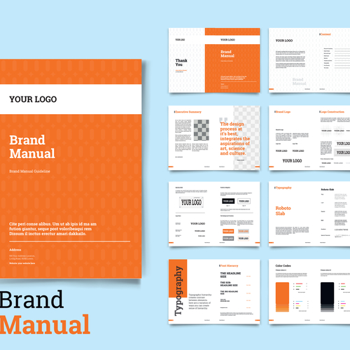
How Do I Create a Style Guide for My Brand?
A style guide is an official document that lays down the rules for managing brand assets such as logos and brand fonts and colors. A style guide provides standards and limitations, but it should never restrain creativity.
Cover and Contents
Style guides start with establishing brand identity through highlighting the main elements, which include the logo, colors and principal typefaces. The goal here is to proactively demonstrate the branding style in creative and attention-grabbing ways. Ideally, it will orientate readers to the goals and background of the company. A concise brand overview will introduce who you are, what you do and how you do it differently than the competition. In order to establish your brand identity, include an engaging business personality that uses a unique tone and voice. This statement can be also used on your company’s website, LinkedIn profile and Facebook account. A contents section will provide structure and help readers quickly locate specific pieces of information.
Brand Motto and Logo
The brand motto, or ethos, is usually expounded on because it succinctly explains the conceptual idea of the brand. All major corporations have a unique motto that goes with their branding because a business’s visual identity is rooted within its logo. Company logos are the most recognizable component of brand identification. Mottoes are specialized through symbols, such as Apple’s iconic apple graphic, or signatures, or typesets, such as Subway and Ralph Lauren. Most companies use a combination of the two, so there needs to be specific guidelines on how to recreate the motto. Decide if you will use different logo versions for different uses, such as one version for letterheads or another for website pages.
Color Palette
Customized color palettes is a must with branded materials because they enliven and illuminate products and services. They can breathe life into vague brands and make them more serious, exciting, luxurious and approachable. From a psychological perspective, colors trigger certain reactions and people associate particular colors and combinations with specific emotive qualities. When finalizing the color choice, bear in mind that colors can be adjusted. In fact, Apple 1980’s logo began as a rainbow filled apple that was used until the late 1990’s when it transformed into the black and silver apple that is universally recognized today. When selecting colors, ask yourself if there will be a principal brand color used on products and a secondary brand color for advertising materials.
Typefaces
New companies with poorly enforced standards may experience sales people creating their own business cards and marketing people creating flyers with experimental fonts. It is important to define the standard fonts for branded materials and the rules of how the fonts should and should not be used. Be sure to specific the exact typefaces and the weights of each font, such as bold, light or regular. Define the fonts used for headings, sub-headings and body text. Decide on your typography preferences for advanced printing concepts such as text tracking and paragraph alignment.
When it comes to using graphics and photography, your style guide should decide if your logo can be set over the tops of pictures and if certain graphic elements from your logo can be translated into other materials.
Related Resources:
