10 Funny Re-Imaginings of Corporate Logos
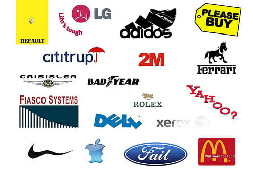
A company logo is the face of corporations around the world, giving consumers an easily identifiable symbol to connect to wherever they go. From fast food logos looming over the interstate to the friendly package delivery driver at the front door, a logo represents who a company is and what a company stands for. The logo represents the image the company wants to project to the public.
The real perception of the public, though, is not always the same impression that the company wants to make. Some parodies of famous logos of some of the biggest companies in the world present a humorous look at an image that is more aligned with the public’s true opinion. From McDonald’s to the Olympics, these humorous parodies depict the controversies and opinions surrounding these companies to make even more of an impact than the original logo.
10. UPS
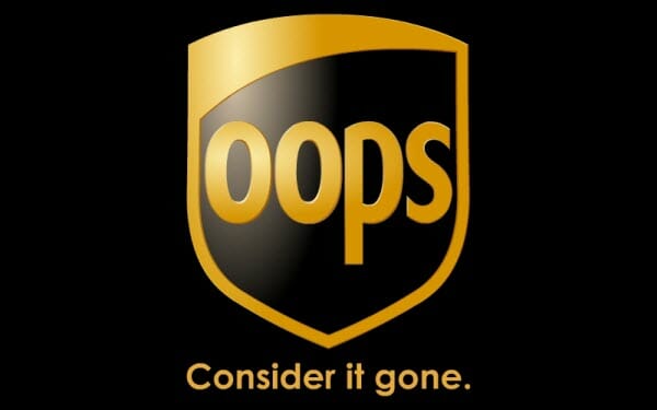
UPS, the United Postal Service, is one of the most profitable companies in the United States, and it has increasingly become the number one choice for mailing everything from holiday packages for family and friends to important workplace documents. It also has made headlines and topped viral video lists with employees carelessly handling fragile packages and has gained a reputation for losing important pieces. For many customers of UPS, the delivered package might end up as broken pieces in a box or a misplaced envelope of important paperwork, never to be seen again. This “Oops” parody of the recognizable UPS logo plays up on that reputation, clearly connecting UPS with “Consider it gone.”
9. Nintendo
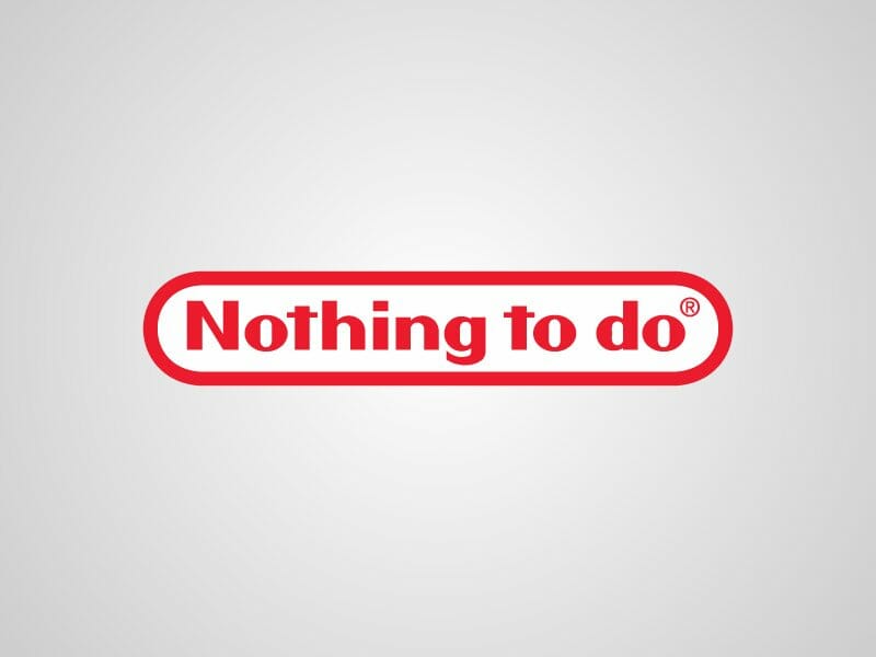
Video games have been controversial for years, cited as propagators of everything from violence, idleness, anti-social behavior, and lower test scores for young children. Nintendo game systems have been on the market for a long time, and the company continues to grow in popularity with recent releases of the WiiU game system and the Nintendo 3DS handheld game systems. With all of the studies and research done on whether or not video games are a waste of time, the parody of Nintendo’s famous logo replaces the company name with the words “Nothing to do,” making for an appropriate connection to general public opinion about what a waste of time video games can be. The parody logo can also double as a reference to the anti-social behaviors of some video game fanatics.
8. YouTube

Image Source
Of all of the digital and social media that has become a part of modern cultures in the past decade, the power of YouTube is perhaps the most pervasive and altering for individual people in their pursuit for fame and fortune. For people looking to get famous, YouTube provides the power of viral videos, and anyone can share practically anything by posting a video to the site. Whether it is a death-defying action feat or performing a song, YouTube can make people famous. One of the most watched types of videos on the site continues to be cat videos, and the phenomenon has magnified and increased the popularity of cat videos around the world. In this parody of a famous logo, replacing the words “YouTube” with “Cat Videos” in the brand’s logo, then, just makes sense.
7. HP
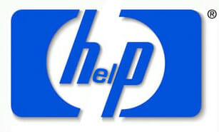
Today’s society continues to rely on technology for everything. From network servers to computers to printers and all of the accessories, HP (Hewlett-Packard) has taken a large corner of the computer technology market. Its company logo features a blue circle with a lower case “h” and “p” in the center. HP is a brand that many people turn to for high quality products, believing in the reputation HP has built. What many customers find out or come to believe, though, is that with technology comes the all too likely possibility of an error message or operation issue. This parody of the famous HP logo stretches out the circle to a square, inserting the letters “e” and “l” in between the “h” and the “p.” The new logo represents the likelihood of a customer’s time spend talking to HP’s help center.
6. Camel
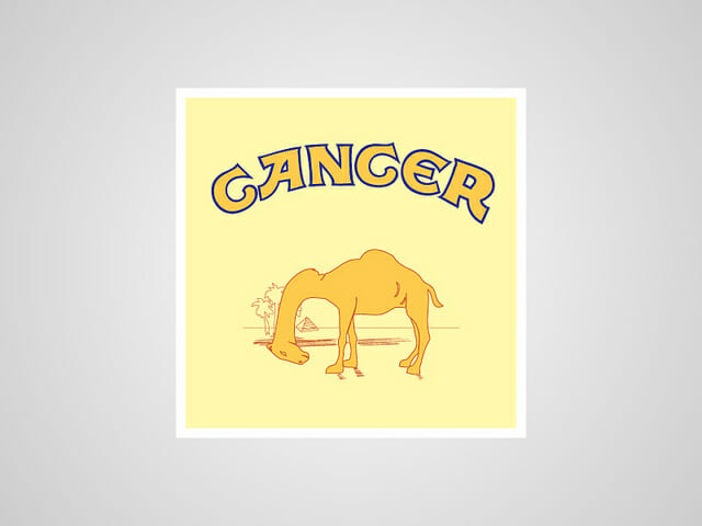
The possibility of getting cancer from smoking cigarettes cannot be ignored, and the reputation that tobacco companies have for intensive marketing campaigns continues to come under fire. One of the biggest controversies surrounding these campaigns has been the acknowledgement of the targeting of children in order to increase brand recognition and increase the chances that those products will be purchased in the future. Many companies have used cartoon characters and iconic American figures to promote their brands. Camel, one of the top cigarette brands in the United States, for example, has a cartoon, “Joe the Camel,” in its advertising. This parody shows a camel, too, but this one is suffering and clearly not well. The word “Cancer” replaces the “Camel” of a company ad in the logo, but perhaps represents the ultimate price of a pack of cigarettes more clearly.
5. The Olympics
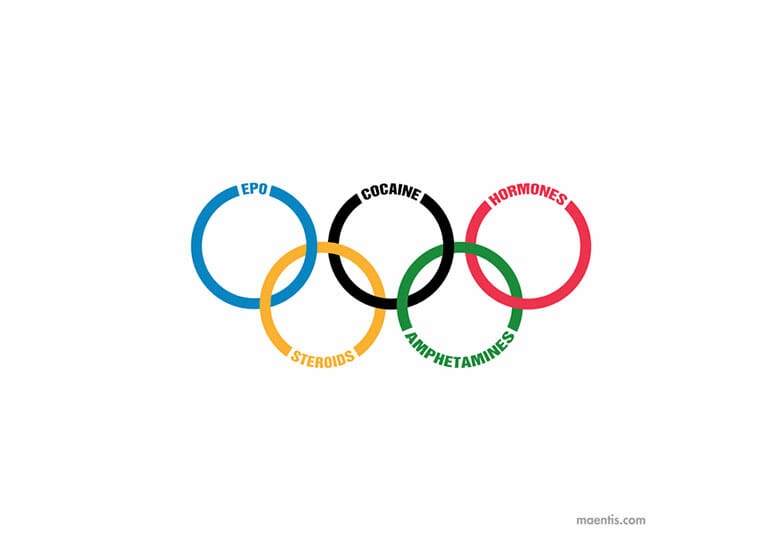
Around the world, professional athletes are looked up to by children and adults, and athletes become role models. Perhaps no other athlete is as revered as the Olympic athlete, who represents his or her respective nation in an epic competition of nation’s around the world working together to earn gold. The Olympic Games logo, a symbol of five multi-colored rings, holds a lot of weight in advertising and promotions, and it is perhaps one of the most well known symbols of all organizations across the world. The popularity of the games, the athletes, and the logo itself magnify the issue when an athlete is found to be using drugs or steroids. The parody logo for the Olympics features the iconic multi-colored rings, but also includes the words EPO, steroids, cocaine, amphetamines, and hormones to represent the increasing number of positive drug tests by Olympic athletes in recent years.
4. BP
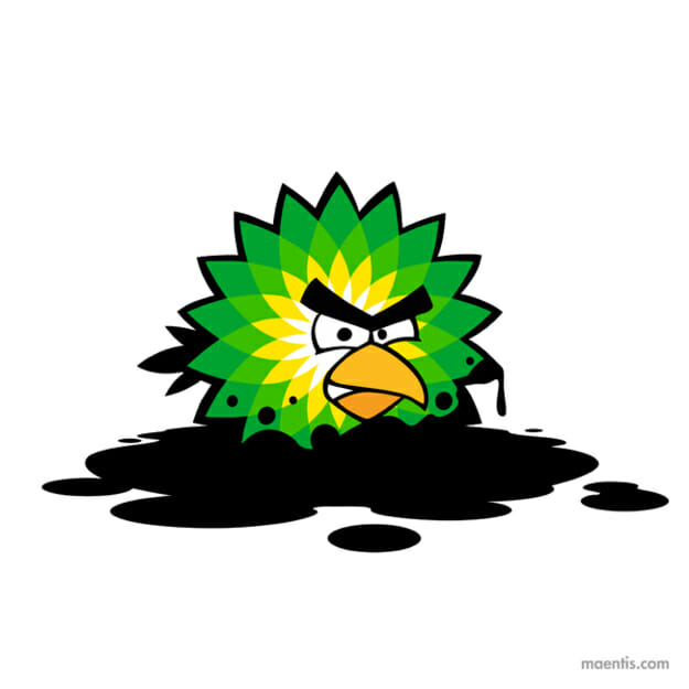
BP, British Petroleum, was one of the leading gas and oil companies in the world, headquartered in London, but the company has suffered from several recent environmental controversies. This included a massive oil spill in Alaska in 2006 and the recent explosion on an oil rig in the Gulf of Mexico in 2010. The company’s logo features a green, yellow, and white star. The parody of the logo keeps the basic shape of the star logo, but adds an “Angry Bird” face. The bird is sitting in a puddle of oil with oil dripping from its feathers and dotted around its face. The logo is clearly representing the environmental damage that the company has been a part of in previous years, particularly the immense spill and the damage done to the wildlife in the Gulf of Mexico.
3. Pepsi
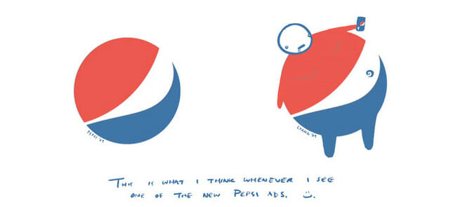
At some point, it seems that people in Western cultures inevitably begin to be concerned with their weight. More recently, the health effects of being overweight have made headlines. Increasing controversy has occurred because of the involvement of the government in discussions on how to decrease the rates of obesity, particularly in children, and particularly in the United States. In some states, cities, and communities, legislation has been proposed and in some cases passed in order to require restaurants and other food service establishments to offer healthier options, including using oils that are free from trans-fats. Another recent trend in the fight against obesity is the role that sugary soft drinks play in weight gain, diabetes, and other health complications. One of the biggest soft drink and beverage companies in the world, Pepsi, branded itself with a blue, red, and white circle. The white in the circle represents a smile, separating the blue and red halves. In a parody, a head, arms, legs, and belly button turn the round circle into a Pepsi drinker.
2. Fox News

With the freedom of speech, the public perception that newspapers and news television shows would present an unbiased and objective picture of current events and public figures developed. In a parody of the Fox News logo, which features the station’s name with spotlights, the brand is changed to “Faux News” with a plea for audiences to “Agree for Fox Sake.” For many people, the controversy of Fox News and other news programs comes from the slanted and biased presentation of the material and information. Commentators and reporters share opinions, and in the news media forum, this is perceived as fact by some of the audience rather than as opinion. “Agree for Fox Sake” is a representation of the view of Fox’s interest in profit share rather than disseminating accurate and fair verifiable facts and reports.
1. McDonald’s
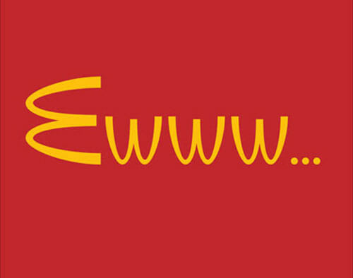
Out of all of the logos that are recognized around the world, the multi-national McDonald’s logo is perhaps the most iconic. With so many McDonald’s giant “M’s” looming over the horizon across the United States and in country’s around the world, it is often one of the first symbols that a child recognizes. McDonald’s becomes the perfect representation of all fast food restaurants, then, as it has been one of the most profitable and successful since it was started. McDonald’s is one of the most beloved institutions in the United States, but it has also been the center of controversy. From documentaries that cite McDonald’s role in childhood and adult obesity to the way in which food is prepared, many consumers have increasingly vowed to boycott McDonald’s restaurants in particular. Flipping the iconic “M” to its side and then upside down to create the “Ewww” fits this growing reputation for what fast food can do to someone’s health.